
Introduction
Matplotlib is one of the most widely used data visualization libraries in Python. Much of Matplotlib's popularity comes from its customization options - you can tweak just about any element from its hierarchy of objects.
In this tutorial, we'll take a look at how to change the font size in Matplotlib.
Change Font Size in Matplotlib
There are a few ways you can go about changing the size of fonts in Matplotlib. You can set the fontsize argument, change how Matplotlib treats fonts in general, or even changing the figure size.
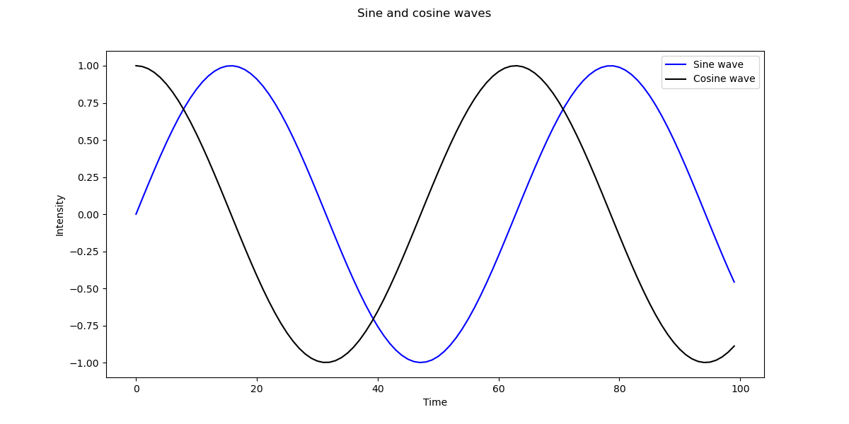
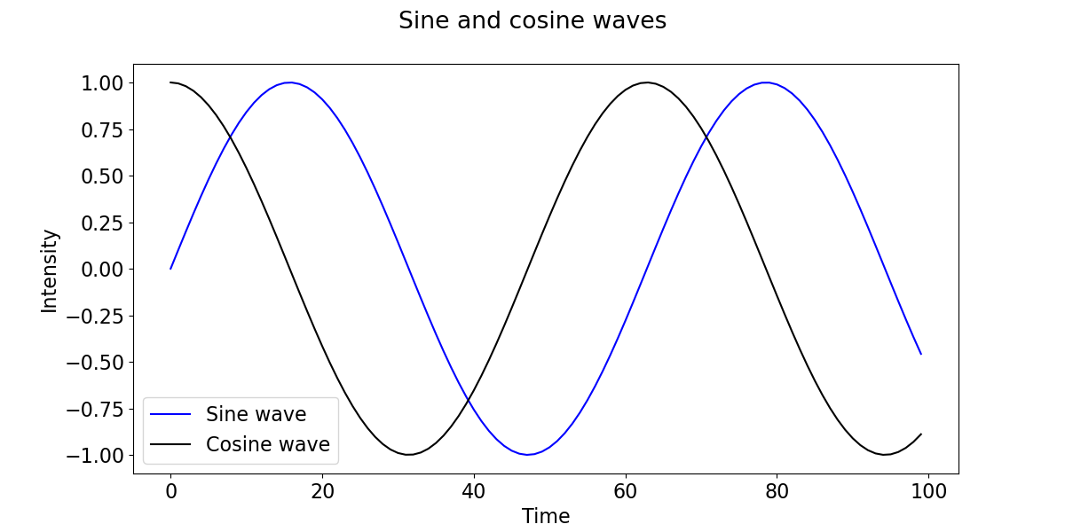
Let's first create a simple plot that we'll want to change the size of fonts on:
import matplotlib.pyplot as plt
import numpy as np

fig, ax = plt.subplots(figsize=(12, 6))

x = np.arange(0, 10, 0.1)
y = np.sin(x)
z = np.cos(x)

ax.plot(y, color='blue', label='Sine wave')
ax.plot(z, color='black', label='Cosine wave')
ax.set_title('Sine and cosine waves')
ax.set_xlabel('Time')
ax.set_ylabel('Intensity')
leg = ax.legend()

plt.show()
Change Font Size using fontsize
Let's try out the simplest option. Every function that deals with text, such as Title, labels and all other textual functions accept an argument - fontsize.
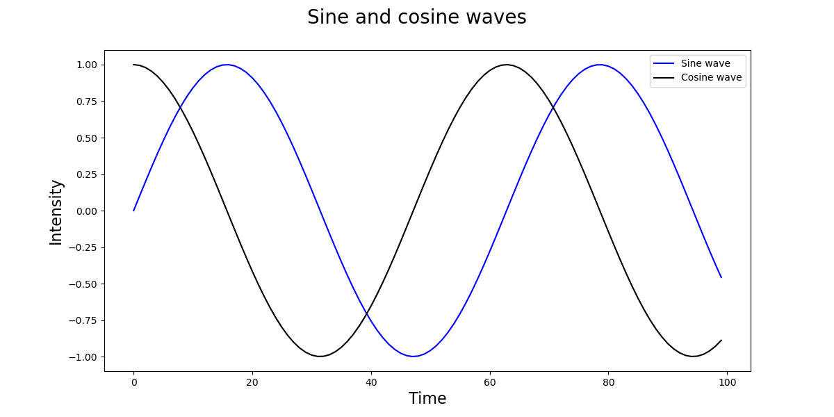
Let's revisit the code from before and specify a fontsize for these elements:
import matplotlib.pyplot as plt
import numpy as np

fig, ax = plt.subplots(figsize=(12, 6))

x = np.arange(0, 10, 0.1)
y = np.sin(x)
z = np.cos(x)

ax.plot(y, color='blue', label='Sine wave')
ax.plot(z, color='black', label='Cosine wave')
ax.set_title('Sine and cosine waves', fontsize=20)
ax.set_xlabel('Time', fontsize=16)
ax.set_ylabel('Intensity', fontsize=16)
leg = ax.legend()

plt.show()
Here, we've set the fontsize for the title as well as the labels for time and intensity. Running this code yields:
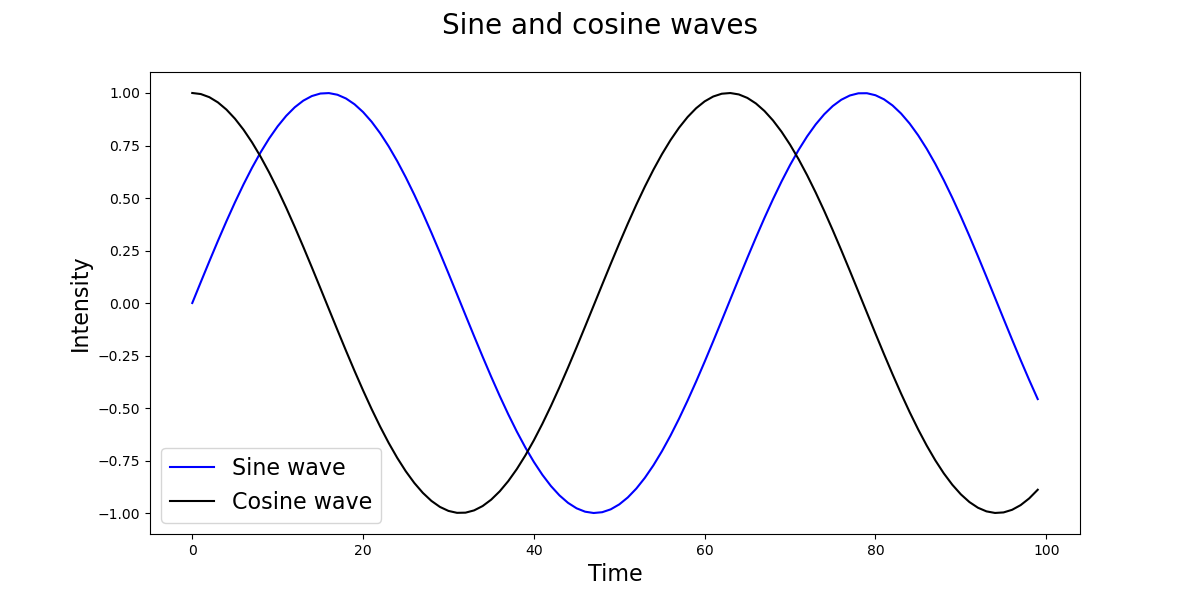
We can also change the size of the font in the legend by adding the prop argument and setting the font size there:
leg = ax.legend(prop={"size":16})
This will change the font size, which in this case also moves the legend to the bottom left so it doesn't overlap with the elements on the top right:
However, while we can set each font size like this, if we have many textual elements, and just want a uniform, general size - this approach is repetitive.
In such cases, we can turn to setting the font size globally.
Change Font Size Globally
There are two ways we can set the font size globally. We'll want to set the font_size parameter to a new size. We can get to this parameter via rcParams['font.size'].
One way is to modify them directly:
import matplotlib.pyplot as plt
import numpy as np

fig, ax = plt.subplots(figsize=(12, 6))

x = np.arange(0, 10, 0.1)
y = np.sin(x)
z = np.cos(x)

plt.rcParams['font.size'] = '16'

ax.plot(y, color='blue', label='Sine wave')
ax.plot(z, color='black', label='Cosine wave')
plt.xlabel('Time')
plt.ylabel('Intensity')
fig.suptitle('Sine and cosine waves')
leg = ax.legend()

plt.show()
You have to set these before the plot() function call since if you try to apply them afterwards, no change will be made. This approach will change everything that's specified as a font by the font kwargs object.
However, when we run this code, it's obvious that the x and y ticks, nor the x and y labels didn't change in size:
Check out our hands-on, practical guide to learning Git, with best-practices, industry-accepted standards, and included cheat sheet. Stop Googling Git commands and actually learn it!
Depending on the Matplotlib version you're running, you won't be able to change these with rc parameters. You'd use axes.labelsize and xtick.labelsize/ytick.labelsize for them respectively.
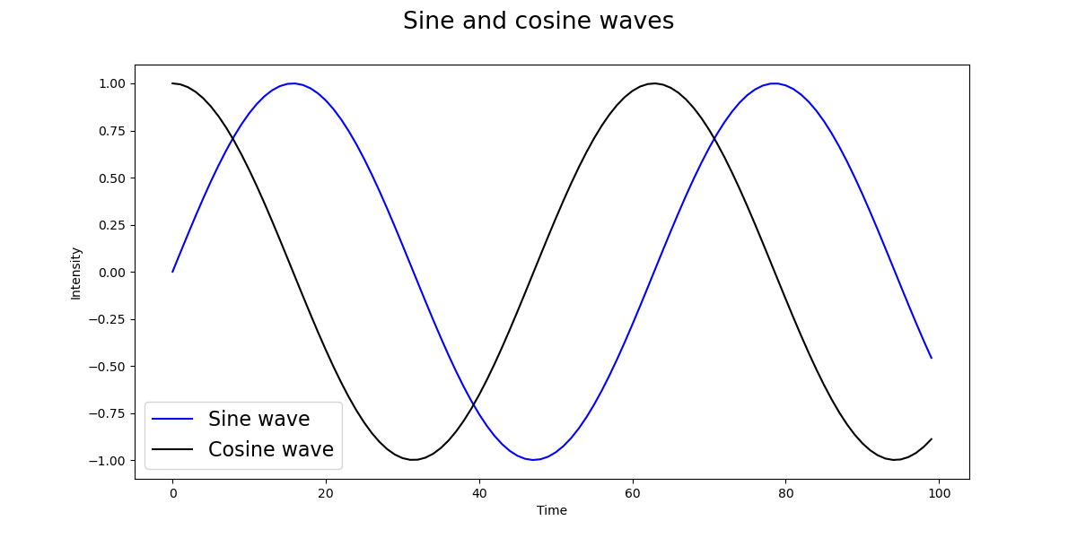
If setting these doesn't change the size of labels, you can use the set() function passing in a fontsize or use the set_fontsize() function:
import matplotlib.pyplot as plt
import numpy as np

fig, ax = plt.subplots(figsize=(12, 6))

x = np.arange(0, 10, 0.1)
y = np.sin(x)
z = np.cos(x)

# Set general font size
plt.rcParams['font.size'] = '16'

# Set tick font size
for label in (ax.get_xticklabels() + ax.get_yticklabels()):
    label.set_fontsize(16)

ax.plot(y, color='blue', label='Sine wave')
ax.plot(z, color='black', label='Cosine wave')
plt.xlabel('Time', fontsize=16)
plt.ylabel('Intensity', fontsize=16)

fig.suptitle('Sine and cosine waves')
leg = ax.legend()

plt.show()
This results in:
Conclusion
In this tutorial, we've gone over several ways to change the size of fonts in Matplotlib.
If you're interested in Data Visualization and don't know where to start, make sure to check out our bundle of books on Data Visualization in Python:

Data Visualization in Python with Matplotlib and Pandas is a book designed to take absolute beginners to Pandas and Matplotlib, with basic Python knowledge, and allow them to build a strong foundation for advanced work with these libraries - from simple plots to animated 3D plots with interactive buttons.
It serves as an in-depth guide that'll teach you everything you need to know about Pandas and Matplotlib, including how to construct plot types that aren't built into the library itself.
Data Visualization in Python, a book for beginner to intermediate Python developers, guides you through simple data manipulation with Pandas, covers core plotting libraries like Matplotlib and Seaborn, and shows you how to take advantage of declarative and experimental libraries like Altair. More specifically, over the span of 11 chapters this book covers 9 Python libraries: Pandas, Matplotlib, Seaborn, Bokeh, Altair, Plotly, GGPlot, GeoPandas, and VisPy.
It serves as a unique, practical guide to Data Visualization, in a plethora of tools you might use in your career.

